Inhaltsverzeichnis
godfather
Hi, I am using bootstrap 3-theme which works quite well on landscape-desktop (Windows) and landscape/portrait-mobiles.
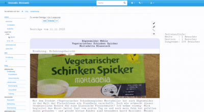
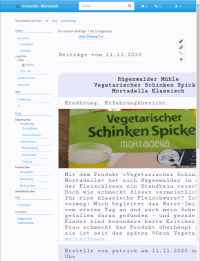
My problem is: I also have a display connected to my desktop in portrait-orientation on which the sidebar keeps staying on the left. So it does on my Windows 10-Tablet. This behaviour a) makes Dokuwiki/Webpage-Developing for portrait-orientation difficult b) results in not readable parts of an article (e.g. sidebar + image + text)
With dokuwiki I run into display-problems due to the sidebar: One example: Using css/vw for sizes does not work in a proper way. On mobile-devices in portrait vw uses the complete width of the viewpoint WITHOUT the sidebar (which is displayed as dropdown-menu now as a topbar). On my desktop-display and on my windows-10-tablet the content is moved to the right due to the sidebar staying on the left. Working with % in sizes is no solution.
Dokuwiki seems to display the sidebar depending on a combination of the User Agent's information the screen orientation and not on only the chosen screen orientation INDEPENDENTLY from the OS.
Is there a possibility of 1) forcing the topbar/dropdown in any orientation (possibly with a up-to-date-plugin) 2) forcing the topbar/dropdown in portrait orientation not depending on the OS
Thanks alot
Patrick
gerardnico
I don't really understand what you are trying to achieve. You start with the sidebar and you finish with the topbar. Seeing a page with the problem would help.
On ComboStrap, the sidebar is in a grid and has a lower order for mobile size than the content. Therefore in a mobile screen, it comes below the main content.
From a responsive point of view, the components inside the sidebar should also be styled responsive (ie width:100%, max-width:100%)
godfather
Good morning Gerardnico,
you are right - with a link or screenshot things might get clearer.
You can visit my webpage here.
A backup of this thread in my dokuwiki
( It's in German and it's highly experimental - just a playground - so don't look at the content ![]() )
)
I also took some screenshots.
Screenshots a): It works!
This is how the webpage looks on a mobile in portrait and a Windows 10-Desktop in landscape (this works as it should):

fig. a.1: mobile portrait (Android/chrome)

fig. a.2: desktop landscape (Windows 10/chrome)
Screenshots b): My problem...
This is how the webpage looks on my Windows 10-Desktop/Tablet in portrait
It should be displayed as in mobile-mode (with a dropdown-topbar instead of sidebar)

fig. b.1: desktop portrait (Windows 10/chrome)

fig. b.2: tablet portrait (Windows 10/chrome/WUXGA)
Screenshots c): Zoom-Workaround...
I recognized that zooming to 150% in portrait mode on windows desktop switches the website to mobile-view
How can I achieve forcing this view for any portrait-mode?

fig. c.1: desktop portrait (Windows 10/chrome/Zoom: 150%)
Regarding to your hint using percentages for width: This is a bad solution using css-functions like "calc()".
Calculating with percentages does not work cross-platform-independent.
Hope this removes missunderstandings.
Patrick